8 Powerful Checkout Page Examples That Made $5M+

Skyrocket conversions. See checkout page examples proven to generate millions. Get inspired and optimize your checkout flow for maximum sales.

Over 70% of carts are abandoned during checkout, and the top culprits are hidden additional costs (taxes, shipping, and other fees), forcing customers to create accounts, and a poorly designed, time-consuming checkout process.
A clunky checkout experience can kill conversions faster than you can say "abandoned cart."
In this article, we will study some winning checkout pages with ridiculously low bounce rates and investigate what they're doing right and what we can learn from them.
Ready to stop leaving money on the table? Let's get started.
TL;DR
- Key Elements: Great checkouts have clear order summaries, transparent pricing, multiple payment options, streamlined forms, progress indicators, and trust signals.
- Single vs. Multi-Step: Both checkout types can work; it depends on your product and audience. Allbirds uses single-page effectively; Nike uses multi-step.
- Mobile Optimization & Building Trust: Everlane offers a mobile-friendly checkout optimized for thumb use, while Obvi offers trust signals like 90-day satisfaction guarantee.
- Streamlined Forms & Smart Upselling: Apple reduces friction with minimal fields and autofill, while Amazon offers a "Buy Now" feature for one-click purchases.
- Express Checkout: JellyBee's checkout page features Express Checkout option at the top, allowing customers to skip the rest of the page.
What Makes a Great Checkout Page? Key Elements to Include
A great checkout page isn't just a formality – it's the final gatekeeper between a browsing customer and a completed sale. Think of it as the cashier at a physical store. A friendly, efficient cashier makes the experience pleasant and encourages repeat business. A slow, confusing checkout? You might just abandon your basket.
So, what are the must-have ingredients for a checkout page that converts like crazy? Let's break it down:
- Crystal-Clear Order Summary: Don't make customers second-guess what they're buying. Display product images, names, quantities, and sizes/variants prominently. This visual confirmation builds confidence.
- Zero-Surprise Pricing: Transparency is king. Break down all costs beforehand so the user isn't off-put by a significantly higher sum later at checkout.

- Payment Option Variety: Cater to everyone. Offer credit card processing, digital wallets (like PayPal, Apple Pay, and Google Pay), and, increasingly, "Buy Now, Pay Later" options (like Klarna or Afterpay). The more choices, the better.
- Form Field Efficiency: Keep it short and sweet. Only ask for the absolute essential information. Enable autofill wherever possible to save customers time and frustration. Nobody enjoys typing their address twice.
- Progress Bar Power: Show customers where they are in the process. A simple progress indicator ("Step 1 of 3") reduces anxiety and keeps them moving forward.
- Trust Signal Overload: Build confidence with security badges (like SSL certificates), guarantees (e.g., "30-Day Money-Back Guarantee"), and social proof (customer reviews or testimonials). These reassure hesitant buyers.

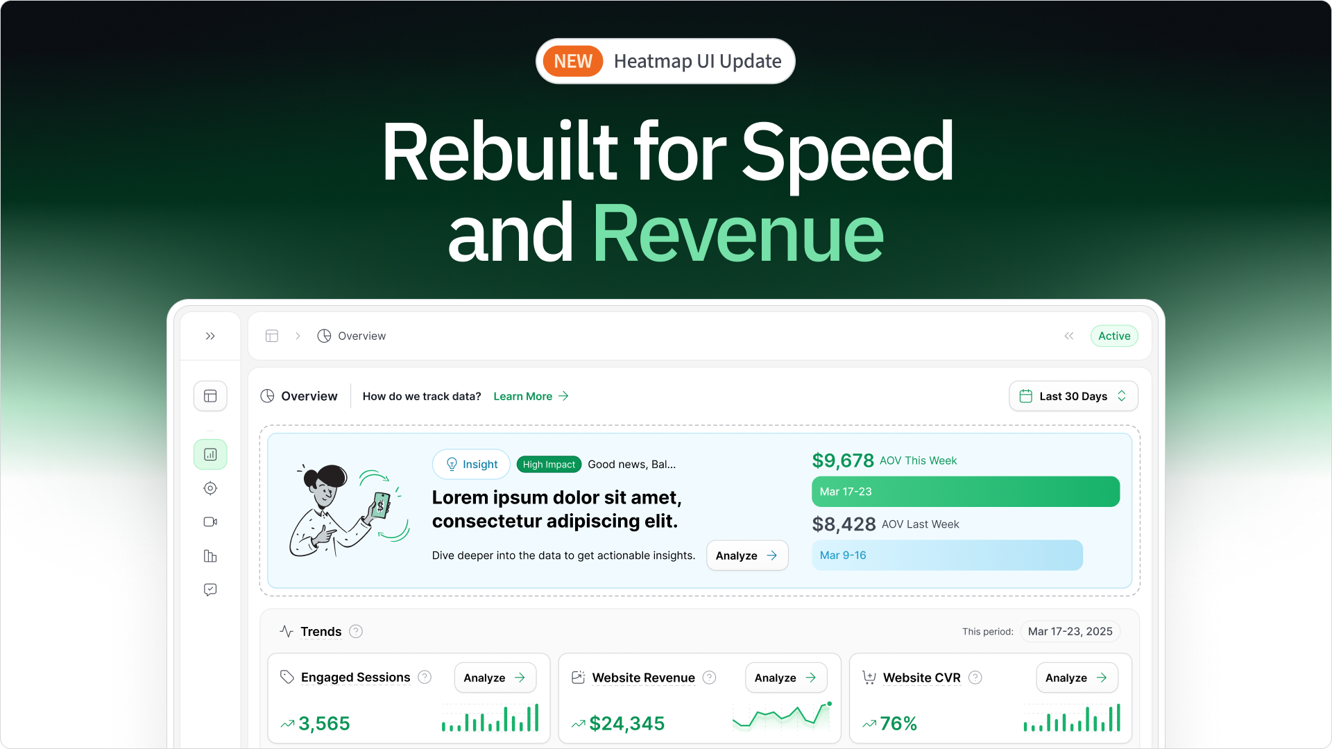
Want to really know what's working (and what's not) on your checkout page? heatmap.com provides revenue-based heatmaps. These go way beyond basic clicks. You see which elements are driving actual revenue and where customers are hesitating or dropping off.

By analyzing user behavior at this crucial stage, you pinpoint exactly where improvements can make the biggest impact. For example, is that "Apply Discount" button being ignored? Is a particular payment option causing confusion? heatmap.com will show you.
Powerful Checkout Page Examples That Supercharge Conversions
We've covered the theory – now let's see it in action. These real-world checkout page examples demonstrate the principles we've discussed, showcasing how smart design choices lead to major revenue gains.
1. Optimizing Checkout Pages with Trust Signals (Company: Obvi)
The checkout stage is where doubts can creep in, causing potential customers to hesitate before completing their purchase.
Obvi addresses these concerns head-on with key trust signals that reassure customers, making them feel confident in finalizing their order.

Here’s what they get right:
- Prominent Trust Messaging: Obvi highlights a 90-day satisfaction guarantee, ensuring customers feel comfortable with their purchase by offering hassle-free returns.
- Social Proof: The Trustpilot rating of 4.6 stars with visible reviews builds credibility, making new customers feel confident in their decision to buy.
- Reassurance of Quality: Obvi emphasizes that their products are manufactured in FDA and GMP-certified facilities, reinforcing trust in the product’s safety and quality.
- Express Payment Options: The integration of PayPal and Google Pay allows customers to make quick, secure payments, improving the checkout process and reducing friction.
Wanting to push their results even further, Obvi used heatmapAI to get insights into their user behavior.
heatmapAI’s CRO recommendation engine suggested moving the CTA button above the average fold of 682 pixels by relocating the disclaimer further down the page.

This optimization increased visibility and led to a 7.81% increase in revenue per session, a 4.69% boost in conversion rates, and $2.5 million in additional revenue.
2. Mobile Checkout Page Examples That Convert (Everlane)
Mobile commerce is no longer the future – it's the present. If your checkout page isn't optimized for mobile, you're losing money. Period. Mobile users are notoriously impatient, so a clunky mobile checkout is a conversion killer.
Everlane, an ethical fashion brand, provides a stellar example of a mobile-first checkout experience.

Here's what they get right:
- Touch-Friendly Everything: Large, easily tappable input fields and buttons. No frustratingly tiny elements.
- Simplified Navigation: A clean, uncluttered layout that's easy to navigate with one hand.
- Thumb-Zone Optimization: Key elements (like the "Continue to Payment" button) are placed within easy reach of the user's thumb. This is crucial for one-handed use.
- Mobile Payment Integration: Prominent options for Apple Pay, Google Pay, and other mobile wallets, streamlining the process.
Mobile users often behave very differently than desktop users. heatmap's comparison mode lets you analyze behavior across devices. Are mobile users struggling with a particular form field that desktop users breeze through? Are they abandoning the cart at a different stage? heatmap reveals these crucial differences, allowing you to optimize specifically for mobile shoppers, who likely make up a significant portion of your traffic. You can easily see if they are converting less, and adjust your strategy accordingly.

3. Streamlined Form Design in Checkout Pages (Apple)
Nobody likes filling out forms, especially on a small screen. A clunky, overly long checkout form is a guaranteed way to frustrate customers and drive them away. The best forms are invisible – they feel effortless.
Apple is renowned for its user-friendly design, and its checkout process is no exception. Their form design is a masterclass in simplicity.

Here's what makes it so effective:
- Minimal Required Fields: Apple only asks for the absolute bare minimum information needed to complete the transaction.
- Smart Autofill: The form leverages browser and device autofill capabilities extensively, saving users tons of typing.
- Inline Validation: Errors are flagged immediately as the user types, rather than after they hit "submit." This prevents frustration and speeds up the entire checkout process.
- Address Lookup: Start typing your address, and the form suggests completions, saving even more time.
4. Leveraging Upsells and Reviews for Higher Conversions (Cooking Guild)

If you want to increase your revenue per session and drive higher conversions, The Cooking Guild's checkout page offers a perfect example of how to do it.
By strategically integrating upsell offers and customer reviews into the checkout process, they effectively maximize their revenue without disrupting the customer experience.
Here’s what they get right:
- Targeted Upsell Offers at Checkout: The Cooking Guild places relevant upsell products during checkout, offering them at discounted prices to increase the cart value.
- Customer Reviews as a Confidence Builder: Incorporating genuine customer reviews at checkout helps reassure buyers, reducing any hesitation about the product’s quality.
- Express Checkout for Faster Transactions: Cooking Guild offers multiple express checkout options, including Shop Pay, PayPal, Afterpay, and Buy Now, Pay Later with Sezzle. These options allow customers to complete their purchases quickly and securely, reducing the need to enter detailed payment and shipping information manually.
- "Remember Me" for Convenience: The "Remember Me" feature allows customers to save their information. This reduces the time needed to complete future purchases by automatically filling in the customer's details.

Cooking Guild leveraged heatmapAI to increase their Revenue Per Session.
heatmap’s data showed that the highest-priced products weren’t giving the highest profitability. heatmap's AI-driven CRO engine recommended rearranging the placement of these products to maximize their impact.

The result?
This single optimization led to a 48% increase in Revenue Per Session, generating significant additional revenue for the business in just the first 30 days!
5. Optimizing Checkout with One-Click Purchases (Amazon)
A smooth, hassle-free checkout process is key to reducing cart abandonment and increasing conversion rates.
Amazon’s "Buy Now" feature takes this to the next level by allowing customers to make purchases instantly.

Here's why it works so well:
- Reduced Friction: The "Buy Now" feature eliminates the need for repetitive entry of payment and shipping details, leading to fewer barriers in the buying process.
- Default Settings for Repeat Customers: After the first purchase, customers can easily buy again with stored payment and shipping preferences, ensuring a seamless experience for repeat purchases.
- Easy Verification and Flexibility: Customers can review and update the delivery and payment details in the "Buy Now" pop-up to ensure everything is correct, giving them full control over the purchase.
6. Optimizing Checkout Pages with Express Checkout (Jellybee)
Express Checkout lets customers complete their purchase in a few clicks, eliminating the need to fill out personal and shipping details upfront — a key advantage on mobile, where long forms can hinder conversions.
Jellybee leverages Shop Pay and PayPal to offer secure, quick payments with minimal input, reducing the time spent on checkout and enhancing the overall experience.

Here's what they get right:
- Express Checkout for Faster Transactions: By placing Express Checkout at the top, customers can skip the rest of the page and complete their purchase instantly using PayPal or Shop Pay.
- Multiple Payment Options for Flexibility: Jellybee understands that one size doesn’t fit all when it comes to payments. They offer a variety of methods including Credit Cards, PayPal, Shop Pay (with installment options), Afterpay, and Bank Deposit. This flexibility caters to different preferences, ensuring customers can choose the method they’re most comfortable with.

- Secure Transactions for Peace of Mind: Jellybee assures customers that all transactions are secure and encrypted, building trust and confidence in the checkout process. Security is a key factor that can push customers to finalize their purchases without worry.
- Convenience of Storing Information: The option to save information for faster checkout via a Shop account means repeat customers can breeze through the process, reducing friction and enhancing the customer experience.
Seeking a way to scale profitably, JellyBee leveraged heatmapAI to identify key areas for improvement on their landing page.
Based on their target demographic of middle-aged women, heatmapAI's CRO engine recommended replacing the bottle-only image with a picture of a middle-aged woman holding the bottle.

This optimization led to a 24.7% increase in Conversion Rate, generating over $650,000 in additional revenue for the year!
Single-Page vs. Multi-Step Checkout: Which Performs Better?
The great checkout debate: one long page or several shorter ones? There's no one-size-fits-all answer. Both approaches have their pros and cons, and the best choice depends on your specific products, customers, and overall brand.
Single-Page Checkout Example (Allbirds)
Single-page checkouts put everything on one screen: shipping details, billing information, payment options, and order summary. The idea is to make the process as fast and frictionless as possible.
Allbirds, the sustainable shoe company, uses a single-page checkout that's a masterclass in minimalist design.

Here's what makes it work:
- Clean and Uncluttered: The page is visually simple, with plenty of white space. This prevents the customer from feeling overwhelmed.
- All Information Visible: No scrolling surprises. Customers can see all the required fields at a glance.
- Clear Section Divisions: While it's all on one page, distinct sections (Shipping, Payment, etc.) are clearly separated, making it easy to navigate.
- Streamlined Guest Checkout: Allbirds enables customers to complete their purchase without the need for account creation, ensuring a fast and hassle-free process.
This approach likely increases conversion rates by reducing friction and making the purchase process feel incredibly straightforward.
P.S. If you want to see exactly how users interact with your single-page checkout? heatmapAI's session recordings provide a fly-on-the-wall view. Do users scroll through the entire page? Do they get stuck on a particular field? Do they miss important information? Session recordings reveal these hidden behaviors, guiding your optimization efforts.

Multi-Step Checkout Example (Nike)
Multi-step checkouts break the process into several distinct pages. This can be less overwhelming for customers, especially if the purchase involves complex details or multiple options.
Nike, the athletic apparel giant, uses a multi-step checkout that guides customers through the process step-by-step.

Here's what makes their multi-step approach effective:
- Clear Progress Indicators: Users always know where they are in the process ("Shipping costs," "Billing," "Review").
- Focused Information: Each step presents only the necessary information, minimizing distractions.
- Simplified Decision-Making: Breaking the process down makes it feel less daunting, especially for larger or more complex orders.
- Guest Checkout at the forefront
This approach likely reduces overwhelm and cart abandonment by guiding customers through a clear, manageable sequence.
However, with a multi-step checkout, it's critical to know where users are dropping off. heatmap.com lets you track user behavior across each step. Are customers abandoning their carts on the shipping page? The payment page? heatmap.com identifies the exact stage causing the most drop-offs, so you can focus your optimization efforts where they'll have the biggest impact. You can then use this data and A/B test different approaches to improve.

Common Checkout Mistakes and How to Fix Them
The checkout page is the final step in a customer's purchasing journey, and small mistakes here can lead to abandoned carts and lost sales. Optimizing your checkout process is crucial to reducing friction, building trust, and boosting conversions.
Below, we highlight common checkout mistakes and provide practical solutions to improve the overall user experience and drive more successful transactions.
The Psychology Behind High-Converting Checkout Pages
It's easy to get caught up in the visuals of checkout page design. But the real magic happens in the customer's mind. Understanding the psychology behind buying decisions is what separates good checkouts from great ones.
Decision Fatigue and Checkout Optimization
Think of your customer's mental energy as a battery. Every decision they make during checkout – every single one – drains that battery a little bit. This is called "decision fatigue," and research from the Journal of Consumer Psychology shows it directly impacts whether someone completes a purchase. More decisions equals a higher risk of abandonment.
Here's how to combat decision fatigue:
- Prioritize Key Decisions: Present the most important choices (like shipping options) early in the process.
- Smart Defaults: Pre-select the most common or recommended options for secondary choices (like gift wrapping).
- "Batch" Decisions: Group related choices together to streamline the process. For example, ask for all shipping information (address, delivery options, etc.) in a single section, rather than spreading it across multiple pages or steps.
- Customize Earlier: If your product involves complex customization, let customers do that before they reach the checkout.
The Progress Principle in Multi-Step Checkouts
People are motivated by progress. Harvard Business School research on the "progress principle" found that a sense of moving forward can significantly boost completion rates in multi-step checkouts – by up to 28%!
Effective progress indicators should:
- Be Visually Clear: Use a progress bar or numbered steps that are easy to see and understand.

- Use Logical Steps: Break the process into meaningful stages (e.g., "Shipping fees," "Billing," "Review").
- Progress Updates: Keep customers informed with messages like “Step 1 complete!” or “You’re almost there!” after each stage to help them stay motivated and engaged throughout the checkout process.
- Avoid Fake Progress: Don't artificially inflate the progress bar – this damages trust.
Checkout Micro-Moments That Build Confidence
It's the little things that matter. Google calls them "micro-moments" – subtle design elements that reassure customers and make them feel in control. These tiny interactions can have a big impact on reducing abandonment.
Examples of confidence-boosting micro-moments:
- Subtle Animations: A checkmark that appears after a form field is successfully completed.

- Clear Error Messaging: Use helpful feedback. For example, instead of saying "ERROR," say "Please provide a valid email" to guide customers and ensure they understand the action to take.
- Helpful Address Verification: Make address lookup feel like a convenience, not a challenge.
- Contextual Loading Indicators: Instead of a generic spinning wheel, show a message like "Processing your payment securely..."
- Post-Purchase Reinforcement: Provide information like “Your new shoes are on their way!” to signal that the order has been successfully processed and reassure customers about their purchase.

This psychological approach goes beyond simply copying what other successful brands are doing. It's about understanding the why behind human behavior at checkout – and using that knowledge to create a truly frictionless, confidence-inspiring experience.
Checkout Page Optimization Perfected with heatmap.com
Optimizing the payment checkout page of your ecommerce store isn't about guesswork – it's about understanding your customers. By combining smart design principles with a deep dive into user behavior, you can transform your checkout from a leaky bucket into a revenue-generating machine.
Key takeaways to remember:
- Simplicity Sells: Reduce friction at every step.
- Trust is Everything: Build confidence with clear policies and security signals.
- Mobile Matters Most: Optimize for the small screen.
- Psychology Pays: Understand the why behind buying decisions.
- Test, and optimize with data.
heatmap.com gives you the ultimate advantage in checkout optimization. It shows you exactly how every element on your page – every form field, every button, every image – impacts your revenue. Stop guessing, and start making data-driven decisions that truly move the needle.
You made it all the way down here? Give Heatmap a try 🤝
We are the only onsite analytics platform that tells you how to make more money - down to the pixel. Trusted by 1000+ eCommerce brands.

Ashvin Melwani
@ashvinmelwaniWith heatmap, I've been able to figure out what elements actually increase AOV and optimize our landing pages to drive more first purchase profitability, we're up 23% YoY.

How You Can Do It:
1: Download heatmap
2: Wait for 5k sessions
3: Reorganize products based on the highest revenue per session from top left to bottom right.

Founder of heatmap, SplitTesting.com, and multiple ecommerce brands. Lifelong optimizer, CRO-lover, and data nerd.

You made it all the way down here?
Might as well give us a shot, right? It'll change the way you approach CRO. We promise. In fact, our friend Nate over at Original Grain used element-level revenue data from heatmap to identify high-impact areas of his website to test, resulting in a 17% lift in Revenue per Session while scaling site traffic by 43%. Be like Nate. Try heatmap today.
