10 UX Analytics Tools That Read Users' Minds

Discover the top 10 UX analytics tools that can enhance user engagement and provide valuable insights. Read more to elevate your user experience strategy!

Are you guessing what your users want? Stop. Data is your compass in the chaotic digital landscape. Without it, you're driving blind. A recent study showed sites using advanced UX analytics saw a massive jump in conversion rates. You can see exactly what's working, and what's not.
We'll show you the tools that transform data into action.
- What UX analytics tools are and why they matter.
- The top 10 tools for 2025, with key features and comparisons.
- Common UX problems, and how to fix them.
And much more. Let's get started.
TL;DR
What a Good UX Analytics Tool Should Do
When choosing a UX analytics tool, it's crucial to focus on its ability to provide actionable insights that improve your site's user experience. A good tool should help you identify areas for improvement, understand user behavior, and optimize for higher conversion.
Top 10 UX Analytics Tools for 2025
Choosing the right tool can feel like picking a needle from a haystack. You want something that delivers real insights, not just more data. We've narrowed it down to the top contenders. These tools don't just track clicks; they uncover the "why" behind user behavior.
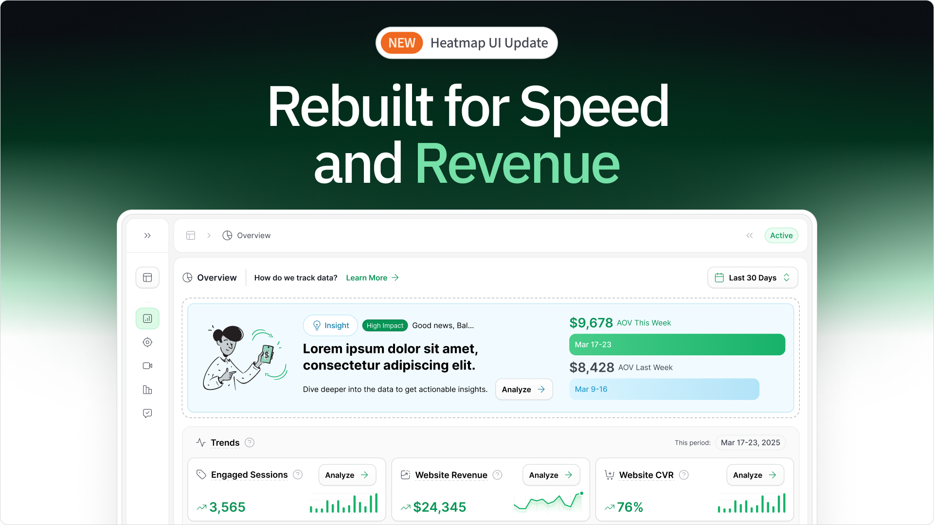
1. heatmapAI

Want to know what really drives revenue? heatmapAI shows you. It connects every click to your bottom line. Forget guessing games. See which elements work, and which ones don't.
Key Features
- Revenue-Based Heatmaps: Visualize the direct financial impact of user interactions on your site. Custom filters let you segment data by behavior, average order value (AOV), traffic source, and more, giving you granular insights into how different user actions contribute to conversions.. This goes beyond simple click tracking, showing you where the money is coming from.

- AI Insights: Leverage AI-powered recommendations to optimize your mobile homepage, collection page, and product display pages (PDPs) for maximum profitability. The AI prediction engine analyzes extensive user behavior data extensive ecommerce data to provide actionable advice.
- Dashboard & Metrics: Gain a quick overview of key performance indicators with an intuitive dashboard. Track revenue per session, scroll depth, and high-traffic pages to identify optimization opportunities.
- Screen Recordings with Revenue Data: Watch anonymized visitor interactions and see exactly how user behavior translates into revenue. Identify high-value behaviors and pinpoint areas for improvement.

- Interactive Scrollmaps with Revenue Drop-off: See where users lose interest and where revenue potential drops. Understand exactly where on the page users stop engaging, and optimize accordingly.
- Comparison Mode: Compare different user cohorts, such as purchasers vs. rage clickers, or high vs. low AOV customers. This allows for data-driven A/B testing and audience segmentation.
- AI-Generated Recommendations: Receive over 500 AI-driven recommendations to improve copy, rearrange page elements, enhance visuals, and optimize other on-page elements to boost revenue per session.
- Rage Click & Top Page Analysis: Identify high-engagement or problematic pages, using "rage click" insights to optimize user experience and reduce frustration.

- Revenue Per Session (RPS): Unique to heatmap, RPS tracks how much revenue each page element generates based on site visits, providing a precise metric for ROI analysis.
- Site Speed Tracking: Built-in tracking monitors site performance, with recommendations to improve load times and enhance the user experience.
Pricing:
- Try Free for 14 Days
- Pay Monthly: $117 USD/month for businesses with annual revenue between $0-$4.9M (pricing scales based on annual revenue)
Considerations:
- Works best with standard web tracking.
- More valuable for stores with higher traffic.
2. Google Analytics

Google Analytics offers a deep dive into your customer's journey. It's more than just traffic numbers; it's about understanding how users interact across your sites and apps. With machine learning, you can uncover insights and predict future behavior.
Key Features:
- Real-time User Tracking and Reporting: Monitor user activity as it happens. See who's on your site, where they're coming from, and what they're doing. This helps you react quickly to trends or issues.
- Advanced Audience Segmentation: Divide your audience into segments based on demographics, behavior, and other criteria. This lets you tailor your analysis and marketing efforts.
- Event Tracking for Specific User Interactions: Track specific actions users take, like button clicks, video views, or form submissions. This gives you granular data on user engagement.
- Conversion and Goal Tracking: Set up goals and track conversions to measure the effectiveness of your marketing campaigns and website design.
- Integration with Google's Ecosystem: Seamlessly connect with Google Ads, Search Console, and other Google tools for a unified view of your marketing performance.
Pricing:
- GA4 Free Version: Access essential tracking and reporting features.
- Google Analytics 360: Premium version for enterprises, starting at $50,000 per year.
Considerations:
- GA4 Feature Discrepancies: Users express frustration over missing features from Universal Analytics, such as detailed sales reports, and the transition to event-based tracking in GA4.
- Interface Complexity: The user interface is often described as complex and not intuitive, requiring time to master.
- Data Sampling Inaccuracies: For high-traffic websites, particularly with the free version, data sampling can lead to inaccuracies, requiring the premium version for precise data.
- Limited Customization for Non-Technical Users: Advanced customization and report creation often require technical expertise, hindering users without coding knowledge.
3. Hotjar

Hotjar combines numbers with real user behavior. See what users do and why they do it. This gives you a complete view of your site's performance.
Key Features:
- Heatmaps: See where users click, move, and scroll. Understand which page elements attract attention and which are ignored.
- Recordings: Watch real user sessions to identify friction points and usability issues.
- Surveys: Get direct feedback from users to understand their motivations and pain points.
- Feedback: Collect user feedback through on-page widgets to gather in-the-moment insights.
- Interviews: Conduct user interviews to gain deeper qualitative insights into user behavior.
Pricing:
- Basic: Free plan for limited use.
- Plus: Starting at $39/month for small teams.
- Business: Starting at $99/month for growing companies.
- Scale: Starting at $213/month for large companies.
Considerations:
- Limitations on Paid Plans: Users mention that even paid plans have limitations on the number of sessions recorded.
- Occasional Slow Loading: Some users report that session recordings can be slow to load.
- Dashboard Navigation: Users have expressed that the dashboard navigation can be cluttered and less streamlined.
- Pricing: Some users find Hotjar to be on the expensive side, particularly as needs scale.
- Free Version Limitations: Users of the free version have reported issues with the relevance of recorded sessions.
4. FullStory

FullStory captures every user interaction, giving you a complete picture of the customer experience. With real-time replays and predictive analytics, you can find and fix UX issues quickly.
Key Features:
- High-Fidelity Session Replays: Capture every click, scroll, and interaction, providing detailed replays that show exactly how users navigate your site. This allows for precise identification of UX pain points.
- Automatic Frustration Detection: FullStory automatically surfaces UX problems by identifying frustration signals like "rage clicks" and error occurrences, highlighting areas needing immediate attention.
- Searchable Session Recordings: Quickly find specific user behaviors using advanced search filters, enabling you to isolate and analyze critical user interactions for UX improvements.
- Funnel Analysis: Visualize and analyze user journeys through your site's conversion funnels, pinpointing where users drop off and identifying opportunities to optimize the UX.
- Error Tracking and Analytics: Identify and analyze JavaScript errors and other technical issues that impact the user experience, allowing for rapid debugging and resolution.
Pricing:
FullStory’s pricing is not publicly disclosed, but user-reported costs range from $299/month to over $1,000/month, depending on sessions and features.
Considerations:
- Pricing Complexity: Pricing can be complex and expensive, particularly for startups.
- Data Accuracy Concerns: Some users have reported concerns about data accuracy.
- Interface Usability: Some users find the interface less intuitive than desired.
- Billing Practices: User reports have mentioned deceptive billing practices and difficult cancellation policies.
5. Microsoft Clarity

Microsoft Clarity is a free tool that shows you how people use your site. It provides heatmaps, session recordings, and insights to help you improve user experience.
Key Features:
- Click and Scroll Heatmaps: Visualize user engagement by seeing where users click, hover, and how far they scroll on your web pages. Identify areas of high and low engagement to optimize page layout and content placement.
- Session Recordings with Playback Filters: Watch recordings of real user sessions to see how users interact with your site. Filter recordings by various criteria to quickly find sessions that highlight specific UX issues, such as errors or frustration points.
- Rage Click and Dead Click Detection: Automatically identify instances of user frustration with "rage clicks" (rapid, repeated clicks) and "dead clicks" (clicks on non-interactive elements), pinpointing areas where users encounter usability problems.
- AI-Powered Insights with Copilot: Leverage AI to quickly surface key user behavior patterns and potential UX issues, providing actionable insights without manual data analysis.
- Seamless Google Analytics Integration: Combine quantitative data from Google Analytics with qualitative insights from Clarity to gain a comprehensive understanding of user behavior and optimize UX based on both metrics and observed user interactions.
Pricing:
- Free, with all features available at no cost.
Considerations:
- UI Chaos: Users find the UI somewhat chaotic, with filter options displayed in a less intuitive way.
- Recording Delays: Some users report delays in session recordings.
- Occasional Page Scroll Issues: There are occasional issues where pages scroll to the top unexpectedly during recordings.
- Data Accuracy: Some users have noted minor data accuracy issues.
- Random Video Availability: Some users have expressed that only random videos are available in the account.
6. Mouseflow

Mouseflow helps you understand user behavior with heatmaps, session replays, and funnel analysis. It turns "huh?" moments into "aha!" insights, helping you optimize your site for better conversions.
Key Features:
- Six Types of Heatmaps: Visualize user interactions with click, scroll, movement, attention, geography, and friction heatmaps.
- Session Replays with Skip Inactivity: Watch user sessions to see how they navigate your site, with the option to skip inactive periods.
- Form Analytics with Field-Level Insights: Analyze form abandonment and identify which fields cause users to drop off.
- Funnel Analysis for Conversion Optimization: Track user journeys through conversion funnels to identify drop-off points.
- Feedback Campaigns Integrated with Analytics: Collect direct user feedback and integrate it with behavioral data.
Pricing:
- Essential: From $39/month for small teams.
- Advanced: From $259/month for growing teams.
- Enterprise: Contact sales for personalized plans.
Considerations:
- Data Overload: Some users find the amount of data overwhelming.
- Pricing Structure: The jump between subscription tiers can be significant.
- Dashboard Complexity: The dashboard can feel overwhelming at first.
- Recording Storage Limits: Session recording storage limits could be more flexible for high-traffic websites.
- WordPress Plugin Update: The WordPress plugin is not consistently updated.
7. Amplitude

Amplitude is a powerful product analytics platform that helps you understand user behavior and drive growth. It offers features like session replay, experimentation, and personalization, all powered by behavioral data.
Key Features:
- Behavioral Cohort Analysis: Segment users based on their actions and behaviors to identify patterns and trends.
- Funnel Analysis with Conversion Tracking: Visualize user journeys and identify drop-off points in conversion funnels.
- Session Replay with Behavioral Analytics: Reconstruct user sessions to see how users interact with your product and identify UX issues.
- Experimentation and A/B Testing: Run experiments and A/B tests to optimize user experiences and improve key metrics.
- Predictive Analytics and AI Automation: Use AI to predict user behaviors and automate insights, helping you make data-driven decisions.
Pricing:
- Starter: Free for up to 10K monthly tracked users (MTUs).
- Plus: From $61/month for small teams.
- Growth: Contact sales for scaling businesses.
- Enterprise: Contact sales for large enterprises.
Considerations:
- Steep Learning Curve: Users report a significant learning curve, especially for advanced features.
- Complex Initial Setup: Setting up event tracking and data configuration can be complex.
- Chart Limitations: Some users find limitations in customizing visualizations.
- Data Tracking Accuracy: Missteps in tracking can lead to flawed analyses.
- User Property Delays: Some users have mentioned delays in user properties being updated.
8. Crazy Egg

Crazy Egg helps visualize user behavior with heatmaps, recordings, and A/B testing, providing insights to optimize your website's user experience.
Key Features:
- Visual Click and Scroll Heatmaps: Generate visual representations of user clicks and scrolling behavior, allowing you to identify areas of high and low engagement and understand how users interact with specific page elements.
- Session Recordings with User Activity Tracking: Replay user sessions to observe how visitors navigate your site, highlighting usability issues and friction points through direct observation of user interactions.
- A/B Testing with UX-Focused Metrics: Conduct A/B tests to compare different page layouts, content, and design elements, and measure their impact on key UX metrics like engagement, task completion, and conversion rates.
- Confetti Reports for Granular Click Analysis: Analyze individual clicks with confetti reports, providing detailed insights into where users are clicking and helping you identify potential usability problems or areas for improvement.
- Overlay Reports for Element-Specific Interaction Insights: Gain insights into how users interact with specific page elements by overlaying click data, helping you understand which elements are effective and which need optimization.
Pricing:
- Starter: $29/month (5,000 pageviews, 5 heatmap reports, 50 recordings).
- Plus: $99/month (150,000 pageviews, 75 heatmap reports, 1,000 recordings).
- Pro: $249/month (500,000 pageviews, 100 heatmap reports, 5,000 recordings).
- Enterprise: $499/month (1,000,000 pageviews, 200 heatmap reports, 10,000 recordings).
- All plans are billed annually.
Considerations:
- Email Spam: Some users have reported receiving excessive emails during trials.
- A/B Testing Issues: Some users have experienced issues with A/B testing affecting website functionality.
- Customer Support: Mixed reviews, with some praising support and others reporting delays and lack of response.
- Trial Cancellation: Reports of predatory trial practices.
- Snapshot Management: Users need to manually create new snapshots after page changes.
- Limited Advanced Analytics: Lacks some advanced analytics and segmentation features.
- Integration: some users desire better integration with Google Analytics.
9. Lucky Orange

Lucky Orange provides a suite of tools focused on visualizing and analyzing user behavior to improve website UX and conversion rates.
Key Features:
- Dynamic Click, Move, and Scroll Heatmaps: Visualize user interactions with your website, identifying areas of high and low engagement to optimize page layouts and content placement for improved UX.
- Session Recordings with Detailed User Interaction Tracking: Watch recordings of individual user sessions to observe how visitors navigate your site, highlighting usability issues and friction points through direct observation of user behaviors.
- Form Analytics for Usability Optimization: Analyze user interactions within forms to identify fields causing abandonment, allowing for targeted improvements to form design and usability.
- Real-time Visitor Behavior Visualization: Observe user interactions as they happen, providing immediate insights into how users are experiencing your website and allowing for rapid identification of potential UX issues.
- Visitor Profiles for Individual User Journey Analysis: Track individual user journeys and interactions, providing a comprehensive view of how specific users experience your website and enabling personalized UX improvements.
Pricing:
- Free: Track up to 100 monthly sessions.
- Build: $39/month (5,000 monthly sessions).
- Grow: $89/month (15,000 monthly sessions).
- Expand: $229/month (50,000 monthly sessions).
- Scale: $899/month (300,000 monthly sessions).
- Enterprise: Contact for custom pricing (700,000+ monthly sessions).
Considerations:
- Data Inaccuracy: Some users have reported issues with data accuracy.
- Recording Issues: Occasional issues with incomplete or cut-off recordings.
- Session Management: Challenges in managing and interpreting session data.
- Limited Free Plan: The free plan has significant limitations.
- Intuitiveness: Some users find the interface less intuitive and the data overwhelming.
10. Mixpanel

Mixpanel is a product analytics platform that helps you understand how users interact with your product, enabling data-driven decisions to improve user experience.
Key Features:
- Event Tracking and Analysis: Track user actions within your product to understand how users engage with specific features and identify areas for improvement.
- Funnel Analysis: Visualize user journeys and identify drop-off points in conversion funnels, helping you optimize user flows and improve task completion rates.
- Cohort Analysis: Segment users based on their behaviors and characteristics to understand how different user groups interact with your product and tailor UX improvements accordingly.
- Session Replay: Connect quantitative data with visual session replays to understand the "why" behind user actions and identify usability issues.
- Dashboards and Reporting: Create custom dashboards and reports to visualize key UX metrics and track the impact of UX improvements over time.
Pricing:
- Free: Capped at 1M monthly events, up to 5 saved reports, and 10K monthly session replays.
- Growth: Starts at $0 (1M monthly events free) and $.00028 per event after, unlimited reports, 20K monthly session replays, cohorts, and more.
- Enterprise: Contact sales for custom pricing, unlimited monthly events, advanced analytics, data governance, and premium support.
Considerations:
- Learning Curve: Some users report a learning curve, especially for advanced features.
- Pricing Changes: Recent changes to the free plan have created challenges for some users.
- Integration Challenges: Integrating with other platforms can be complex.
- Documentation: Some users find the documentation lacking.
- Data Export API: Some users suggested that the data export API needs improvement.
Common UX Issues Identified Through Analytics
UX analytics tools excel at uncovering these frequent problems:
How this 7-figure UK Fashion Brand Increased Revenue Per Session by 13%+ with this UX analytics tool
A UK fashion brand used heatmapAI to identify friction points in their checkout process. By addressing issues with size selection and product image visibility, they achieved:
- +4.22% increase in conversion rate
- +13.07% increase in revenue per visitor
- +14.19% increase in average basket size
- +34.48% increase in filter usage
- +13% increase in overall revenue.
Challenge:
- A rapidly growing UK fashion brand faced customer frustration due to lengthy product searches and out-of-stock items on PDPs.
- The filter on the collection list was placed at the top, often missed by users, leading to wasted time and lower conversions.
Solution:
- Heatmap analytics revealed users who used the filter generated 3x more revenue.
- Scroll-depth analysis and session recordings showed users only accessed the filter after extensive scrolling.
- Conducted an A/B test, making the filter larger and "sticky" so it remained visible as users scrolled.
"heatmap’s revenue-based analytics were instrumental in uncovering this opportunity. Seeing exactly how users interacted with the collection pages - and how it correlated with revenue - gave us the confidence to implement these changes. The data spoke for itself."
— Jordan Hill, Founder, That Works Agency

Key Takeaway:
- Making the filter more accessible significantly improved the user experience and drove revenue.
- Granular, revenue-linked behavioral insights are crucial for identifying and addressing UX issues that impact the bottom line.
Ready to Maximize Your UX Analytics Using heatmapAI?
Want to get the most out of your UX web analytics tool? heatmap offers the visual data you need to identify issues, improve user journeys, and boost conversions. Begin translating user actions into meaningful improvements now, and let your data guide you to a superior user experience.
Start your free trial of heatmapAI today and unlock the power of visual analytics to transform your website. See what your users are really doing and drive measurable growth.
You made it all the way down here? Give Heatmap a try 🤝
We are the only onsite analytics platform that tells you how to make more money - down to the pixel. Trusted by 1000+ eCommerce brands.

Ashvin Melwani
@ashvinmelwaniWith heatmap, I've been able to figure out what elements actually increase AOV and optimize our landing pages to drive more first purchase profitability, we're up 23% YoY.

How You Can Do It:
1: Download heatmap
2: Wait for 5k sessions
3: Reorganize products based on the highest revenue per session from top left to bottom right.

Founder of heatmap, SplitTesting.com, and multiple ecommerce brands. Lifelong optimizer, CRO-lover, and data nerd.

You made it all the way down here?
Might as well give us a shot, right? It'll change the way you approach CRO. We promise. In fact, our friend Nate over at Original Grain used element-level revenue data from heatmap to identify high-impact areas of his website to test, resulting in a 17% lift in Revenue per Session while scaling site traffic by 43%. Be like Nate. Try heatmap today.
