Qualities of A Great Website: 7 Essential Elements for Success

Discover the essential qualities of a great website. Learn key factors for success, from usability to design, ensuring your online presence stands out.

Is your website working for you, or against you? A confusing or slow site doesn't just annoy visitors; it actively hurts your revenue potential. First impressions happen fast online. Forget guesswork. This guide details the core qualities your site needs to succeed. We show you how to build an experience that keeps users engaged and actually converts.
In this guide, you'll learn how to:
- Design around your users' needs to create a seamless, intuitive website experience.
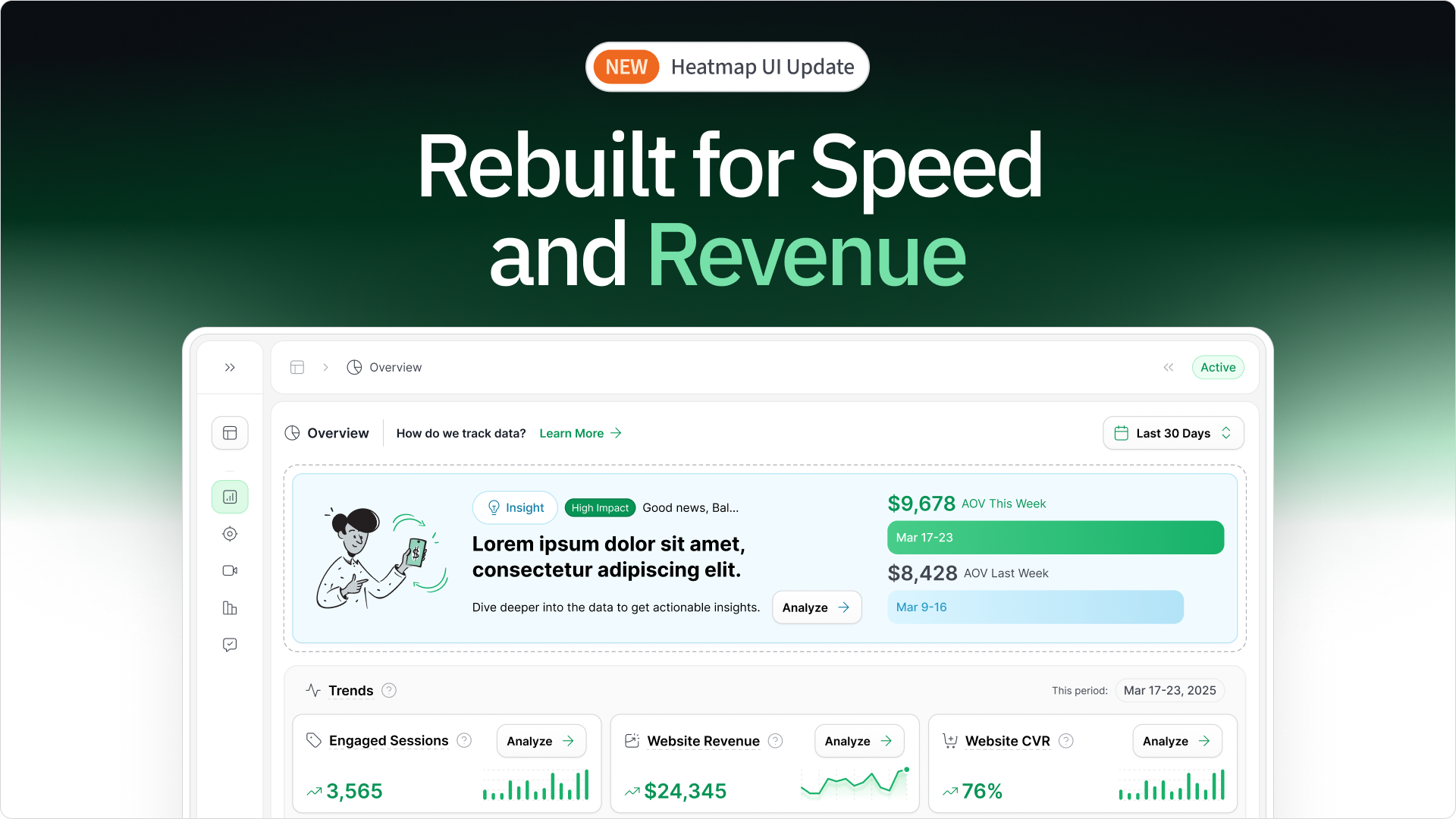
- Use heatmaps to see exactly where users get confused and drop off your site
- Eliminate the hidden friction points that frustrate users and kill sales
Let's dig in.
TL;DR
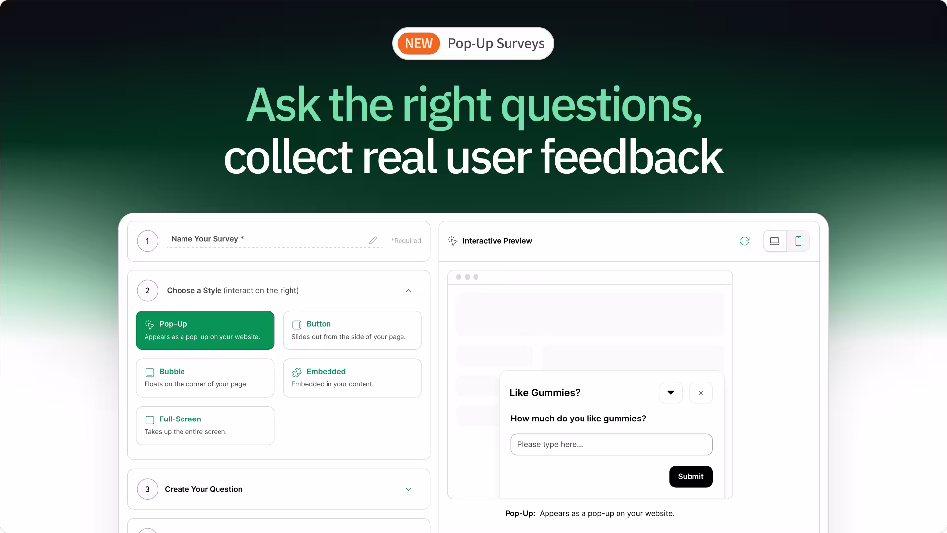
- Design for Your Users: Create detailed user personas to identify their motivations and pain points, then validate with heatmapAI's session recordings to understand actual user behavior.
- Build Intuitive Navigation: Use clear, descriptive menus, maintain a consistent layout, and ensure mobile-friendly tap targets (44px+). Optimize search with filters for easy access.
- Optimize Technical Performance: Compress images to load in under 2 seconds. Ensure responsive design across devices and structure your HTML with proper heading hierarchy.
- Design with Accessibility in Mind: Add descriptive alt text for images, maintain a 4.5:1 contrast ratio for readability, and ensure full keyboard navigation across your site.
- Create Valuable Content: Address user needs with clear, concise content. Place CTAs strategically after key information or at decision points, like after explaining a product's benefits.
- Showcase Trust Signals: Display HTTPS & SSL certificates, a money-back guarantee, client reviews & ratings, and secure payment options.
1. Designing Entirely Around Your User
Forget flashy features for a moment. A truly great website starts with one thing: understanding the people who use it. If your site doesn't connect with your visitors and make their lives easier, it's not doing its job. User-centric design isn't just a buzzword; it's the bedrock of online success.
Understanding Your Audience
You can't build a site people love if you don't know who they are. That means digging deeper than basic demographics.
Create detailed user personas by identifying:
- Their core motivations and goals.
- The specific problems they need to solve.
- Their pain points and frustrations.
- Typical online habits and behaviors.
Use user research methods like heatmapAI's survey tool for direct feedback. But remember, analyzing actual behavior shows what people truly do.
This is where heatmapAI's session recordings shine. Watch anonymized recordings to see exactly:
- Where users click and engage.
- How far they scroll down a page.
- Points where they hesitate or seem confused.
- Where they get stuck or drop off.
Designing with clear user goals in mind ensures every element serves a purpose, guiding visitors smoothly.

Intuitive User Experience
Have you ever landed on eCommerce sites and felt instantly confused? That's cognitive load – making users think too hard. An intuitive experience feels effortless.
Aim for a predictable user interface by:
- Sticking to familiar web conventions (e.g., navigation placement).
- Keeping interactions simple and clear.
- Maintaining consistency across your site.
- Making buttons and links clear.
Hunt down and eliminate friction points. These are roadblocks like confusing forms, hidden information, or unexpected actions that cause frustration and make people leave.
Knowing what drives results is key. heatmapAI's revenue-based heatmaps go beyond simple clicks to show you:
- Which specific elements lead to actual sales.
- The financial impact of buttons, links, and images.
- Where users are engaging profitably.

Take the Obvi case study, for example. Using heatmapAI, they saw their main call-to-action button was below the average fold on crucial pages. Users weren't able to find it easily. By simply moving it up, they boosted revenue per session by 7.8%. That’s a direct link between intuitive design and bottom-line results.
2. Effortless Navigation And Clear Structure

Consider your website's navigation as its roadmap. Good structure guides visitors easily, leading them where they want to go without hitting dead ends. Poor structure? That just leads to frustration and quick exits.
Navigation Best Practices
Clear navigation isn't about fancy tricks; it's about making things obvious. Users should instantly know how to get around.
Here are some core practices:
- Simple Menus: Use clear, descriptive words for categories. No jargon or clever names that confuse people.
- Consistency is Key: Keep your navigation in the same place on every page. Predictability builds confidence.
- Robust Search: Especially for larger sites, good search is essential. Include filters and helpful suggestions. (Optimized search often leads to much higher engagement).

- Breadcrumbs: For sites with many levels, breadcrumbs show users their path and let them backtrack easily.
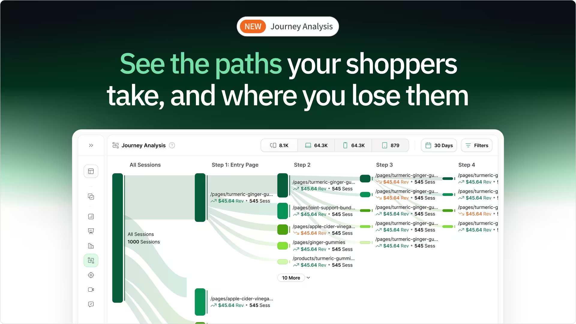
Don't just guess what works. Analyze actual user behavior with heatmapAI. See where people click, where they hesitate on navigation, and optimize based on real data, not just assumptions. You might be surprised which paths users actually take.
For instance, How that Works, A UK fashion brand used heatmapAI to identify two key friction points in the user journey: users struggled with a poorly placed product filter and found it difficult to navigate back to the top of the page to use it.

After optimizing the filter’s placement, making it sticky and more accessible, the brand saw a +13% increase in revenue per session.
Information Architecture
Good navigation relies on solid Information Architecture (IA). This is how you organize and structure your content logically.
Effective IA involves:
- Logical Grouping: Organize content in ways that match how your users think about your products or topics. Keep related things together.
- Clear Hierarchy: Use headings, font sizes, and spacing to show the relationship between different pieces of information. Guide the eye naturally.
- Strategic Internal Linking: Connect related pages within your site. This encourages users to explore more and can help reduce bounce rates.
- Helpful Site Maps: Provide an overview of your site's structure for both users and search engines. It aids navigation and helps search crawlers understand your content.
3. Visuals That Enhance The Experience
Looks do matter, but not just for show. Smart visual design makes your site easier to use, builds trust, and can directly guide users towards taking action. It's about using colors, text, and images with purpose.
Effective Color Schemes
Color does more than paint your site; it sets the mood and directs attention.
Key things to get right with color:
- Brand Consistency: Use palettes that match your overall brand. This builds recognition and trust.
- Strategic Guidance: Use color to highlight CTAs or important information.
- Accessibility First: Ensure enough contrast between text and backgrounds. WCAG guidelines recommend at least a 4.5:1 ratio for readability. Don't make people strain to read.
Typography and Readability
How your text looks is just as important as what it says. Good typography makes reading effortless.
Focus on these readability factors:
- Font Choice: Select web-safe fonts for consistency or implement custom fonts carefully for branding. Prioritize clarity.
- Text Formatting: Keep line lengths comfortable (around 50-75 characters), use ample line spacing (roughly 1.5x font size is a good start), and ensure strong text-background contrast.
- Mobile Matters: Use larger font sizes (at least 16px for body text) and optimize spacing for smaller screens.
Optimized typography keeps people reading longer. User behavior analysis, like that seen through heatmapAI, often shows significant increases in session duration when readability improves.
Strategic Use of Images and Media
Images and videos grab attention quickly, but they need a strategy.
Make your media count:
- Quality & Relevance: Use high-resolution, relevant images. Original photos often connect better than generic stock.
- Optimization is Crucial: Properly size images, choose the right format (like WebP) and use tools like TinyPNG or ImageOptim to reduce image file sizes without losing quality.
- Smart Video: Integrate short, focused videos with clear CTAs. Optimize them for fast loading (use lazy loading).
Data helps place visuals for maximum impact. In The Cooking Guild case study, insights from heatmapAI led to strategic media placement changes. The result? A stunning 48% increase in revenue per session on their collection pages. That shows the power of data-informed visual design.

4. Peak Technical Performance And Speed
A well designed website isn't just about looks or content; it needs a solid technical foundation. Performance details like speed and mobile-friendliness directly shape how users experience your site – and whether they stick around.
Page Speed Optimization
Speed kills... conversions, that is. Slow-loading sites frustrate users and hurt your bottom line and search rankings.
How much does speed matter? Research, including data from heatmapAI, shows sites loading in under 2 seconds have conversion rates nearly twice as high as sites that take 5 seconds or more to load. Faster is better. Period.
Key ways to boost speed include:
- Optimizing Images: Compress and correctly size all images.
- Minifying Code: Shrink CSS, JavaScript, and HTML files.
- Using Browser Caching: Let returning website visitors load faster.
- Leveraging a CDN: Deliver content from servers closer to the user.
- Reducing Server Response Time: Optimize your hosting setup.
- Fixing Render-Blocking Resources: Ensure critical content loads first.
Don't just optimize once. Use heatmapAI's built-in site speed tracking to constantly monitor performance and catch issues before they slow you down.

Mobile Responsiveness
Most web traffic now happens on phones. If your web designer doesn't build it for mobile, you're ignoring the majority of your target audience. Mobile-first design isn't optional anymore.
Responsive design is the standard. It means your site automatically adapts to fit any screen – phone, tablet, desktop – using flexible layouts and images.
Pay attention to touch-friendly elements:
- Larger Tap Targets: Make buttons and links easy to tap (aim for 44x44 pixels minimum).
- Adequate Spacing: Don't cram interactive elements too close together. There should be at least 8 pixels of space between each tap target.
- Simple Mobile Navigation: Use familiar patterns like hamburger menus for easy, intuitive navigation on mobile devices.
Technical SEO Foundations
Effective technical SEO ensures search engines can crawl, index, and access your site efficiently. It’s the behind-the-scenes optimization that improves site performance and visibility.
Focus on these foundations:
- Clean Code: Use well-structured, valid HTML. Semantic markup helps search engines grasp context.
- Proper Headings: Use H1-H6 tags logically to structure content. Only one H1 per page, matching the main topic.
- Schema Markup: Add structured data to help search engines understand specifics (like product info, reviews) for potential rich snippets.
- XML Sitemaps & Robots.txt: Guide search crawlers efficiently, telling them what to index and what to ignore.
5. Content That Connects And Guides Action
You can have the best design and fastest site, but without quality content, visitors have no reason to stay. Great content answers questions, solves problems, and speaks directly to your audience's needs.
Creating Valuable Content
Your content's main job? Be genuinely useful to your visitors.
Focus on delivering value by:
- Addressing User Needs: Understand their questions, problems, and interests. Create content that provides real answers and solutions.
- Maintaining Consistency: Use a consistent brand voice and tone across your entire site – from blogs to product descriptions. It builds identity.
- Keeping it Fresh: Regularly update existing content and add new, relevant information. This signals activity to users and search engines.
- Ensuring Readability: Don't overwhelm visitors. Break up text using subheadings, bullet points, short paragraphs, and white space. Make it easy to scan and digest.
Obvi's blog is a strong example of content that resonates with users. It effectively addresses key health concerns like weight loss and skin health by blending useful tips with product benefits. The tone is friendly and aligned with the brand’s voice, creating a relatable experience.

In addition, the "Take a Quiz" feature enhances the user experience by helping visitors identify their specific health and beauty needs through a series of personalized questions. This quiz not only directs users to the most relevant products but also deepens the connection between the brand and the customer.

Effective CTAs
Content informs, but CTAs drive action. They tell users what to do next.
Make your CTAs count with these best practices:
- Strategic Placement: Put key CTAs where users expect them, often above the fold. Weave secondary CTAs naturally into longer content.
- Follow Best Practices: Use action-oriented words ("Get Started," "Shop Now"), create visual contrast so they stand out, and ensure they clearly state the benefit.
- A/B Test Everything: Don't assume you know what works best. Test different versions of your CTAs. Key variables include:
- Button color and size
- Wording (the text itself)
- Placement on the page
- Surrounding elements

Go beyond simple click tracking. heatmapAI helps you identify which CTAs generate the most revenue, not just clicks. This lets you optimize based on actual financial impact.
6. Building An Inclusive Experience For All
A good website works for everyone, regardless of their abilities or how they access the internet. Building with accessibility and inclusivity in mind isn't just the right thing to do; it creates a user-friendly experience for all users and broadens your reach.
Web Accessibility Standards
Following established standards ensures your site is usable by people with diverse abilities. The main guidelines are known as WCAG (Web Content Accessibility Guidelines).
Key technical standards include:
- Alt Text for Images: Provide descriptive alt text for images to ensure screen readers can interpret them. This also helps search engines understand and index your visuals, improving SEO.
- Keyboard Navigation: Ensure users can navigate and interact with everything on your site using only a keyboard (no mouse required).
- Screen Reader Compatibility: Use proper HTML structure and ARIA attributes (when needed) to ensure screen readers can correctly interpret your content. Test with actual screen readers.
Inclusive Design Principles
Inclusive design means thinking broadly about different user needs and preferences from the start.
Core principles to embrace:
- Sufficient Color Contrast: Make sure text and important elements stand out clearly against their backgrounds. Tools like the WebAIM Contrast Checker can help verify your choices.
- Readable Fonts and Sizes: Use clear, legible fonts. Offer ways to adjust text size if possible. Set the font size to at least 16px for body text. For optimal readability, ensure line spacing (line height) is set to 1.5x the font size to avoid crowding.
- Accessible Forms: Use clear labels with <label> tags for all form fields and provide simple error messages next to the relevant fields. Ensure forms are fully navigable with the keyboard by testing Tab and Shift+Tab. Offer clear, easy-to-understand instructions to guide users through the process.
7. Earning Visitor Trust And Confidence

Visitors won't convert if they don't trust you. Building credibility isn't instant; it comes from showing you're legitimate, secure, and reliable through various signals across your site.
Building Website Credibility

Small details add up to create a trustworthy impression.
Show users they can rely on you with:
- Professional Design: A clean, error-free, and consistent design signals competence and attention to detail. It builds confidence right away.
- Social Proof: People trust what others say. Include elements like:
- Testimonials and reviews
- Case studies
- Client logos
- User statistics or counts
- Security Indicators: Make sure to protect user data. Key indicators include:
- SSL certificate (https:// in the URL)
- Clear privacy policy and terms of service
- Trust badges from recognized user security providers (if applicable)
- Transparent Contact Info: Show you're a real business. Make it easy to find:
- Physical address (if relevant)
- Phone number
- Email address
Performance Metrics That Matter
Beyond looking trustworthy, your site's performance reveals user confidence (or lack thereof).
- Conversion Rate Optimization (CRO) is the ongoing process of improving your site to get more visitors to take desired actions (like buying, signing up, etc.).
- Bounce rate tracks visitors who leave after viewing only one page. High bounce rates often point to problems. Common causes include:
- Slow page load speed
- Irrelevant or unclear content
- Confusing navigation
- A weak value proposition
Reducing bounce rates means fixing why people leave. A strategic web design process helps, and tools like heatmapAI can pinpoint exactly where users disengage or run into friction by analyzing their behavior on the page.
Go deeper than basic numbers. Use user behavior analytics to spot potential trust issues. Hesitation on certain forms, rage clicks on confusing elements – these patterns, visible through heatmapAI, can reveal credibility gaps you might otherwise miss.
Our tool doesn’t just tell you what’s happening; it also provides over 500 AI-driven recommendations. These actionable insights help enhance copy, rearrange page elements, improve visuals, and optimize on-page elements to increase conversions.
Ready to Optimize Your Website’s Performance with heatmapAI?
A truly successful website aligns user intent with your business goals. Getting all the elements—smart design, solid tech, valuable content—working together smoothly is key, especially for the sites aiming to build genuine customer loyalty and achieve results.
Here’s a quick recap of the essentials:
- Focus intensely on user needs and intuitive design.
- Build clear navigation and logical site structure.
- Use visuals strategically for impact and clarity other than being visually appealing.
- Prioritize technical performance, speed, and mobile readiness.
- Create valuable, relevant content with strong CTAs.
- Ensure accessibility and inclusivity for all users.
- Establish trust signals and build credibility.
Achieving all this requires seeing your site through your users' eyes. heatmapAI provides revenue-focused analytics – just like heatmaps but linked to sales and session recordings – showing precisely what works and what doesn't. Optimize based on real behavior and financial impact, not just guesswork.
You made it all the way down there? Give Heatmap a try 🤝
We are the only onsite analytics platform that tells you how to make more money - down to the pixel. Trusted by 1000+ eCommerce brands.

Ashvin Melwani
@ashvinmelwaniWith heatmap, I've been able to figure out what elements actually increase AOV and optimize our landing pages to drive more first purchase profitability, we're up 23% YoY.

How You Can Do It:
1: Download heatmap
2: Wait for 5k sessions
3: Reorganize products based on the highest revenue per session from top left to bottom right.

Founder of heatmap, SplitTesting.com, and multiple ecommerce brands. Lifelong optimizer, CRO-lover, and data nerd.

You made it all the way down here?
Might as well give us a shot, right? It'll change the way you approach CRO. We promise. In fact, our friend Nate over at Original Grain used element-level revenue data from heatmap to identify high-impact areas of his website to test, resulting in a 17% lift in Revenue per Session while scaling site traffic by 43%. Be like Nate. Try heatmap today.
