The Ultimate Heatmap Analysis Guide for 2025


The only heatmap analysis guide you need for 2025. Learn proven strategies to analyze user behavior and maximize your website’s potential.
Website heatmaps have become essential for the modern CRO specialist - but most marketers don't know how to leverage them effectively. And quality heatmap analysis can take a measly 2% conversion rate to a juicy 5%. That would literally be a 250% increase in your business.
This guide will show you the three types of heatmaps, the 6 core insights you should learn from heatmaps, and the reason why most heatmaps are hilariously outdated—and what you can do to stay ahead of the curve.
What is a heatmap and why is it used?
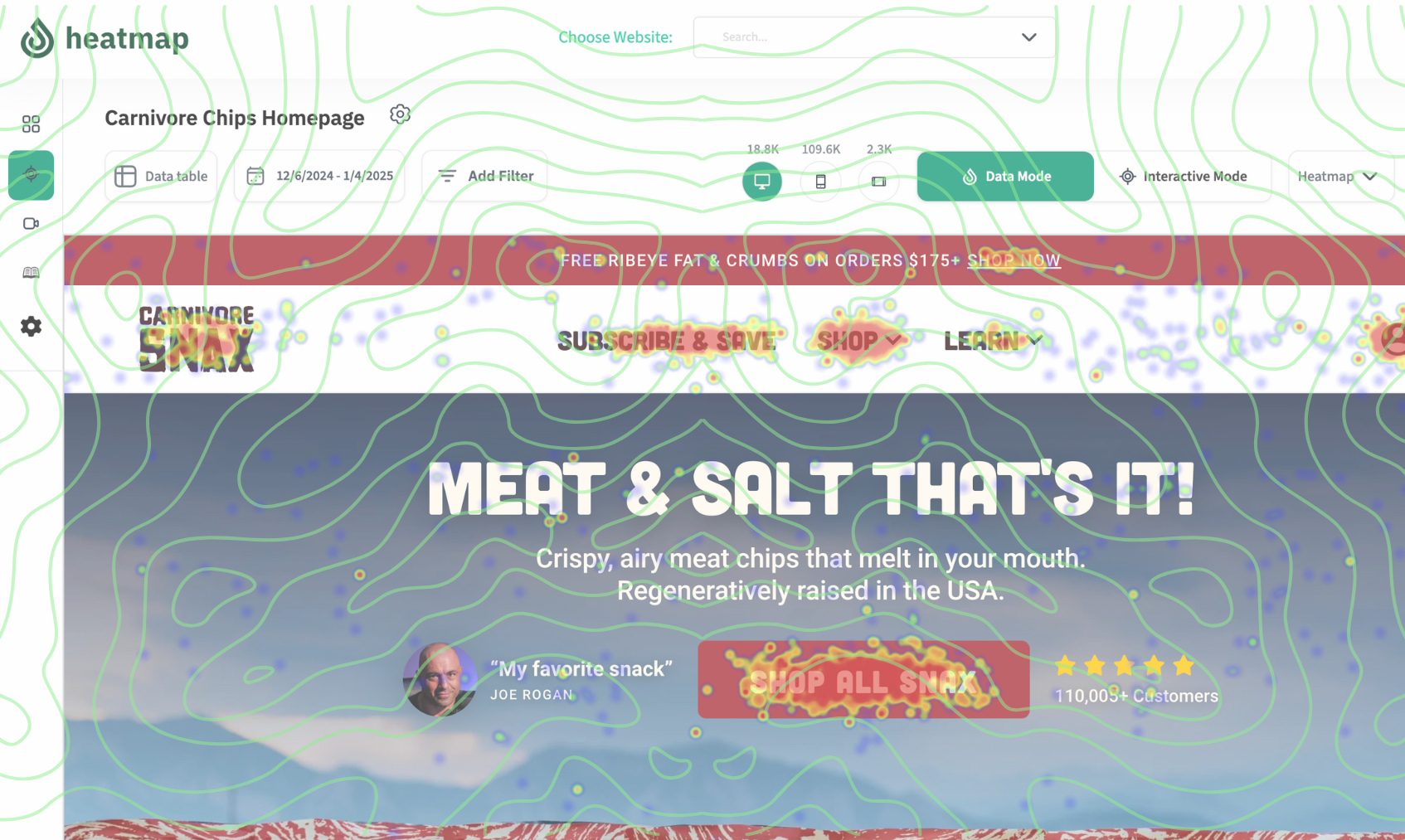
A heat map tells you what users are—and aren't—paying attention to on your site. It's called a heatmap because it color codes popular sections and elements like a heat tracker based on user activity—red being the hottest (or most engaged) and blue being the coldest (or least engaged).
What does a heatmap tell you?
Heatmaps have become an indispensable tool because they show what's working and what's not based on visual representations of how users interact with your website. These data points enable you to continually iterate for a smoother user journey, and ultimately a higher conversion rate.
What is heatmap analysis?
A heatmap is like an x-ray of your website. It's a graphical representation of user clicks and user interactions. Heatmap analysis is the interpretation of the x-ray to identify trends and determine what's going well and what's going wrong. By incorporating a regular feedback loop to identify user behavior, you gain actionable insights to design content in a more intuitive way that removes friction and drives performance.
It's important to understand that when reading heatmaps, North American users have a natural tendency to read in an “F” pattern—left to right and top to bottom. So a heatmap will generally follow an F pattern. So you need to be cautious about concluding the left-most and/or highest content is the most compelling just because it's getting clicks. It's more interesting when data runs counter to this natural tendency because it indicates something is bucking the norm—for good or bad reasons.

The main types of heatmaps and why you'd use them
Depending on the software you're using, you might have access to several types and subtypes of heatmaps. But there are 3 main breeds that you need in your arsenal if you're after that silky smooth user experience.
Click maps
The GOAT of heatmaps: this visual representation shows where users click. This looks like clusters of heat around areas of the website page that are meant to be clicked—but that's not always the case. And a click map will often identify non-clickable elements that many users mistake as clickable.
Rage click heatmaps are an important derivative of click maps that show page elements with repeated clicks that indicate user frustration.

Scroll maps
A scroll map reveals just one insight: how far users scroll down a given page.
The top of the page is red hot because everyone who visits the web page will—at minimum—see above the fold. Which is why you want your real estate above the fold full of key elements. In a perfect world, you'll see a 100% red page. But since we live in the real world, you'll see a pronounced drop off in user retention just below the fold with a sustained dropoff as the page goes on.
Don't panic if you see that fewer than 50% of users navigate below the fold. That's actually normal. But it means there's room for improvement! Armed with insights from scroll maps, you can keep testing section placement to increase the overall proportion of red.
👉 By the way, heatmaps aren't the only way to understand user behavior on your site. Check out these heatmap alternatives.

The 6 mission-critical user behavior insights you discover from heatmap analysis
Ensuring your most popular elements are driving the desired outcome
Using a click map, find the top 3 most clicked elements on each page you're looking at. This includes everything on the page—even the stuff that's not ‘clickable.'
Finding the top elements on each page is crucial for CRO because these buttons, images, and sections should be driving users towards your desired end goal. And if they're not, then you have work to do to ensure your content is organized in a more intuitive manner. If you find one of these elements is more of a distraction than a conversion asset, then experiment with moving and/or removing it.
Problematic clicks
Heatmaps don't lie about how many visitors actually interact with your landing pages, which can be a humbling experience for many a UX designer. 9 times out of 10 you'll discover people click where they're not meant to. The odd click can't be helped. But if you identify patterns of user confusion then it's time to make some changes.
People are going to click images, things that look like buttons, underlined text, and occasionally testimonials. If it makes sense within the context of the page and your desired outcome, you should make the element clickable. Alternatively, experiment with adding a strategic CTA near the oft-clicked area. In the event of a “useless click” you should test modifying the element or removing it entirely.
Clickable assets that aren't getting clicked
If something is meant to be clicked, but it's not getting any love, then you need to change it, move it, or get rid of it. If a necessary clickable element—such as a scroll button on a carousel or variant selector on a product page—is Clickless in Seattle then you need to call more attention to its clickable nature. Drop shadows, borders, underlines, and dynamic motion will help attract the user's eye. Testing its placement on the page or within the section is also a good option. And you'll want to be mindful of dynamic elements on the page that aren't revealed by heatmaps—like a chatbot widget or popup—because these might be hiding or obscuring clickable elements.
Navigation (Nav Bar) optimizations
Heatmap analysis is the only way to optimize the navigation bar experience. The nav bar is the unsung hero of any web page. Everyone will see it. Most visitors interact with it. So you should regularly review click maps to see which tabs and icons get engagement—or lack thereof.
Tabs that get clicks should be front and center, while tabs that get no clicks should probably get removed. You'll also want to pay attention to tabs with dropdowns because sometimes the dropdown functionality isn't clear to users, and you may find it's actually preventing users from seeing important nav options.
One final thing to consider for sites and apps with lots of content, pages, or SKUs, is that you need to pay attention to users relying on the logo to return to the home page. Ideally people are using the search function to navigate instead of reverting home each time—a comparatively clunky experience. And if your site is fairly light on content and/or SKUs, then you'll want to consider adding more tabs to the nav bar.
Key elements and sections that don't get seen
Every landing page has key page elements and sections that need to get seen. For example, in E-commerce, sections featuring social proof increase conversions so you want to ensure visitors scroll past some reviews and/or testimonials. If you know what your conversion elements are (note: you definitely should!), then regularly evaluate your scroll map to confirm what percentage of visitors actually see them.
Also, if you find people interact with certain, high-value call-to-action buttons lower on the page, test moving them higher up the same page to see if they yield even more engagement.

Device-specific opportunities & issues
Any run-of-the-mill heatmap tool will offer device-specific insights for PCs, tablets and mobile devices. Users behave differently on each, so UX designers will gain different insights into visitor behavior from just one web page.
The main benefit to cross-device analysis is identifying device-specific design flaws. You might find a section or element that works well on a computer doesn't garner as much attention with mobile users or vice versa. If most people seem to toggle through product images on computers, but relatively few do so on mobile, then your users probably can't tell that there are multiple images to browse or how to browse them.
The shockingly big problem with traditional heatmap data analysis
A website heatmap is a necessary web analytics tool if you're serious about conversion. But heatmaps have a massive problem: they oversimplify complex data in purely quantitative terms. Not all clicks are created equal! And a high number of clicks doesn't always mean they've translated to any revenue.
That's why the qualitative future of heatmap tools includes click data enriched with revenue and conversion data so you can identify the valuable elements on your site. It's tempting to think that because only 5% of people see your footer that the footer is unimportant. But what if 50% of those people are the ones who convert in your store? Or what if a carousel gets just a few clicks, but an inordinate amount of those clicks lead to high revenue purchases? With Hotjar heatmaps and other analytics tools you can't tell the difference.
With heatmap you get quantitative and qualitative data. You don't just see how many clicks each element gets, but a full breakdown of individual UI elements like AOV and conversion rate—it's the first heatmap in the world to assign revenue details to clicks so you can see the true quality of each click. You can also customize your dashboard like an advanced analytics platform to identify high value customers and traffic sources.
The future of heatmap analysis is quantitative and qualitative. Don't get left behind.
How You Can Do It:
1: Download heatmap
2: Wait for 5k sessions
3: Reorganize products based on the highest revenue per session from top left to bottom right.


You made it all the way down here?
Might as well give us a shot, right? It'll change the way you approach CRO. We promise. In fact, our friend Nate over at Original Grain used element-level revenue data from heatmap to identify high-impact areas of his website to test, resulting in a 17% lift in Revenue per Session while scaling site traffic by 43%. Be like Nate. Try heatmap today.
